Christmas Is Run DMC: A Field Guide to Last-Minute Craft Kit Orders That Still Look Premium
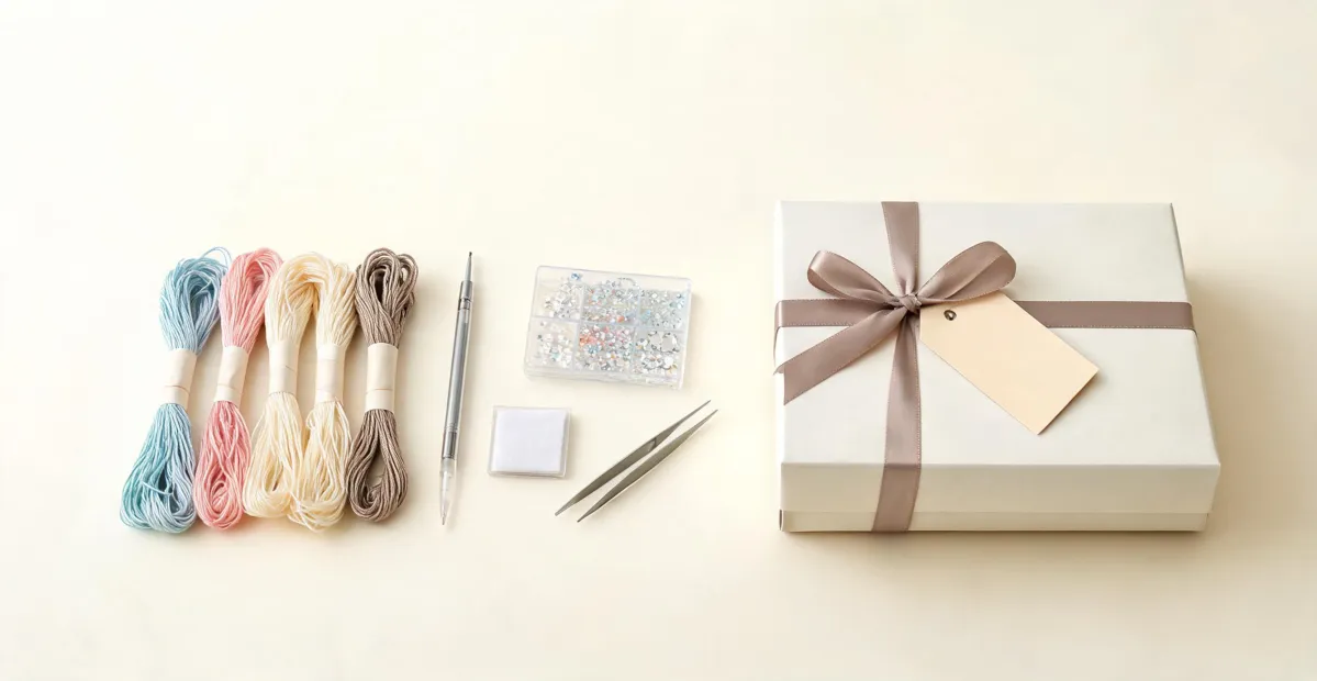
If you're sourcing custom craft kits for Christmas, here's what I wish someone had told me in 2018: don't let deadline pressure talk you out of a standardized color system. The orders that damage client relationships are rarely the late ones—they're the off-color ones. When you're ordering embroidery kits, diamond painting sets, or paint-by-number packages for corporate gifts, "off-color" means a factory guessed on a color match instead of referencing the DMC chart. And now 500 kits have a sky that's slightly too pink.
I manage production and custom orders for a craft and gift wholesaler. I've handled 200+ rush orders in seven years, including a Q4 season where we pushed 47 orders through between October and December. 95% on time. The two failures had nothing to do with shipping speed: both times, a factory ran short on DMC floss and swapped in a similar shade from another producer. Nobody caught it until the kits were packed. Both clients said the same thing—"this isn't what we approved." One of those was a $14,000 order we absorbed entirely.
The direct answer to the question I get at every trade show—how do you handle last-minute Christmas orders without turning them into a quality gamble?—is this: separate speed from color accuracy. Rush the schedule. Never rush the spec.
Why I get to say this
I've been coordinating bulk orders with craft manufacturers since 2018. That means I've sat on the receiving end of vendor mistakes, explained reprints to clients with events in 48 hours, and tested the difference between "cheap and fast" and "fast and controlled." My own approach shifted pretty dramatically in that time. When I first started working with factories, I assumed a rush order was a license to relax quality expectations—you pay more, things move faster, something gives. But I watched that logic backfire enough times that I stopped treating quality as negotiable. The schedule is negotiable. The color standard isn't.
A concrete example: in March 2024, a corporate client called at 4 pm needing 800 personalized embroidery kits for a spring activation the following Tuesday. Normal turnaround for that volume is eight to ten business days. We found a producer willing to run six straight days, paid $620 in rush premiums on top of the $9,800 base cost, and delivered Sunday afternoon. The kits weren't perfect—we skipped the individual bag reinforcement (which, honestly, I'd still skip)—but every DMC color code was correct, because we made that conversation non-negotiable. The client's alternative was canceling the activation entirely. They told us later that giveaway was the biggest traffic driver of their quarter.
That experience is also what led our company to formalize what I call the 48-hour buffer rule: if a client says "we need it by Friday," we quote Wednesday. It costs a little goodwill in the moment, but it has saved us more than once when a supplier inevitably slips.
The DMC color chart is your contract
Here's something that surprises a lot of first-time gift buyers: a free DMC diamond painting color chart with names is one of the most useful specification tools in the industry. It's not just a pretty page of colors—it's a universal reference that your factory, your warehouse checker, and your client can all use to agree on what "red" means. The numbers get all the attention, but the names matter too, because they make the chart usable for colleagues who don't think in codes.
With diamond painting accessories, the difference between one shade and its neighbor is almost invisible to a non-crafter. But put two rows of diamonds side by side—one approved, one substituted—and the mismatch is glaring once it's under a living room lamp. DMC numbers let you write one line in the purchase order: "Use DMC 987, 988, and 989 for the foliage sections." No photos. No "you know what I mean." No room for a supplier to decide they know better.
The same logic applies to cross stitch supplies and embroidery kits. DMC thread has been the common language of stitchers for generations (the company's roots go back to 1746), and there's a reason experienced crafters will not accept a substitute floss color without checking the code. When you're ordering for a corporate client, remember that a 30-year stitcher might be standing at that gift table. They will catch a wrong blue. They will mention it on Instagram.
How to make a paint by number look better
Last year alone, seven different buyers asked me this exact question, so let's settle it. The way to make a paint by number look better is not more paint. It's legible numbers and a controlled palette.
I figured this out the hard way when a batch of custom paint by number kits for a hotel chain arrived with the numbers printed too small to read comfortably. Recipients applied the wrong colors across entire sections, and we got photos back that looked like a watercolor painting that had fallen down the stairs. The paint itself was fine. The problem was the instruction layer.
So when you're sourcing paint by number kits, ask these two questions:
- What's the minimum number size on the canvas? It should be readable at arm's length, not after three glasses of mulled wine on December 22nd.
- How tight is the border registration? A slightly misaligned outline turns a relaxing craft into a frustrating guessing game.
And push your supplier toward a standardized color family rather than "mix your own shade!" prompts. The second option sounds artsy, but for a corporate gift you want the recipient to complete the thing without needing a fine-art degree.
When "Christmas is run DMC" is more than a pun
There's a phrase that circulates in the crafting community around this time of year: Christmas is run DMC. I've always liked it because it's a decent pun, but it also contains a practical truth: DMC's color codes are what make Christmas projects run smoothly at scale. DMC 321 is the bright red you see in ornament kits, DMC 699 is Christmas green, DMC 444 is the lemon yellow you'll find in any holiday star pattern. If I ask a supplier for "Christmas colors," I'll get a shrug and a swatch that changes depending on who's on the phone that day. If I ask for DMC 321, 699, and 444, the supplier can't mishear me.
That's the entire advantage, and it matters even more when you're ordering custom promotional gifts. The color code is the cheapest insurance policy you'll buy this season, and the chart itself is free.
Where this stops applying
I should be honest about the limits of this advice, because the worst thing I can do is overshoot its weight class. If your holiday project involves a corporate logo embroidered directly into a garment or printed on packaging, the color conversation moves past craft codes and into Pantone Matching System territory. Industry-standard tolerance for brand-critical colors is Delta E < 2—that's from Pantone's Color Matching System guidelines, and a Delta E between 2 and 4 is noticeable to trained observers. I'm not a print color expert, so when a client needs that level of exactness, I loop in our prepress vendor and reference the Pantone Color Bridge before anything goes near a press.
Also, if your holiday packaging includes a full-bleed photo or tiny text, insist on 300 DPI at final print size for your art files. That's the standard commercial print minimum. Large-format banners can get away with 150 DPI if they're viewed from a distance, but a box insert can't. If a supplier says "it's fine" at 150 DPI, they're telling you what you want to hear. Get a second opinion.
One more caveat: this is based on what I'd learned as of the 2024 production season. The craft supply chain keeps changing, and your region might be completely different. Verify current lead times with suppliers before booking a rush order. The color codes, though, will still be the same. That part happily never changes.
If you're reading this and feeling the Q4 panic creeping in, take one concrete step this week: download the free DMC color chart and email it to your supplier with your order quantities. It takes ten minutes, it costs nothing, and it turns an endless back-and-forth about "which red?" into a silence so clean it feels like Christmas morning.

Elise Laurent
Elise Laurent is a crystal and decorative glass quality analyst covering crystal figurines, vases, ornaments, suncatchers, and gift glassware. She examines ISO 6486-1 where food-contact glass dinnerware applies, then uses polarized strain inspection, dimensional checks, surface-defect grading, and refractive clarity to compare decorative pieces outside that scope. Her work helps sourcing teams choose materials, finishing routes, and protective packaging without confusing visual brilliance with verified durability.